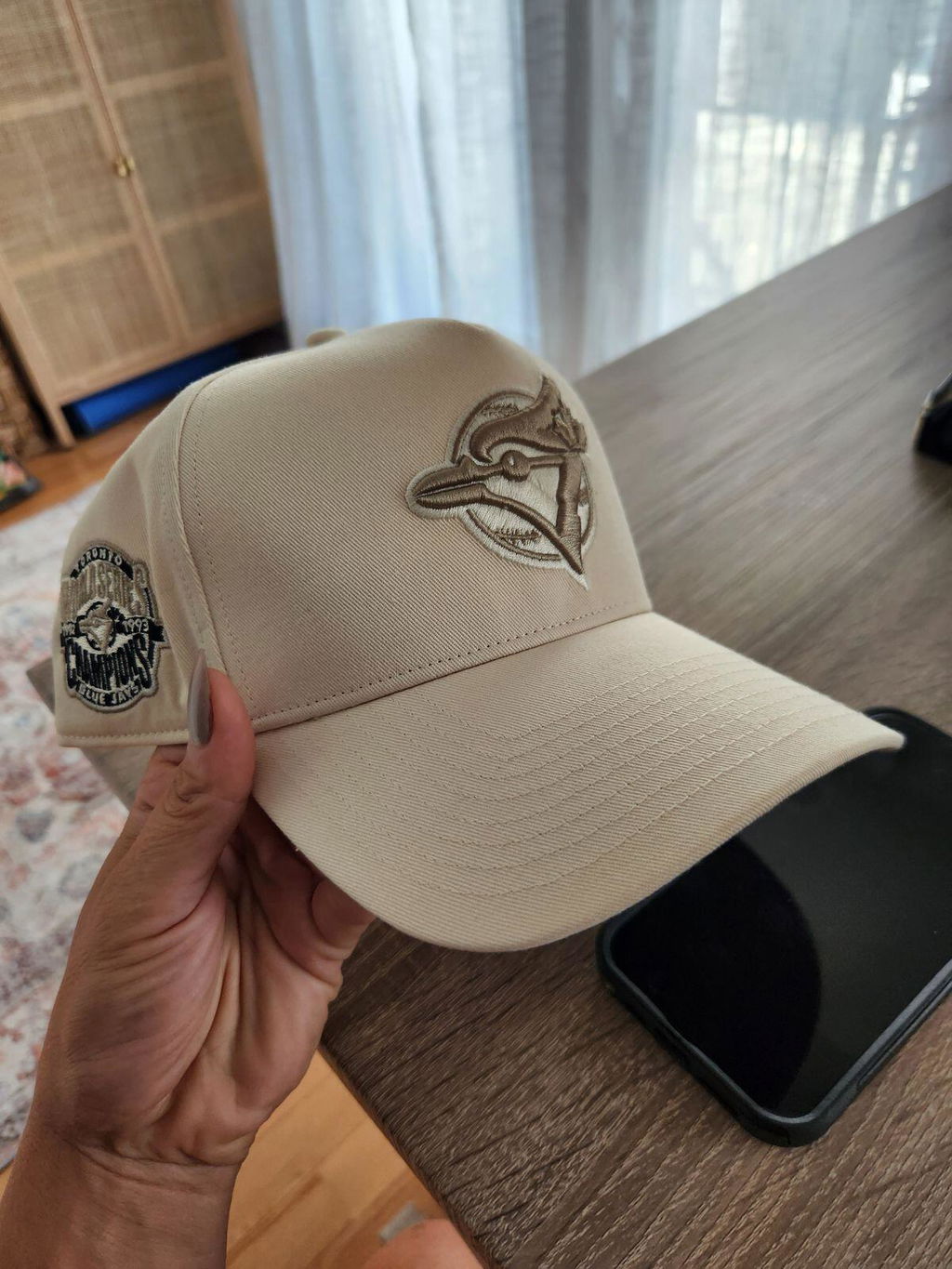
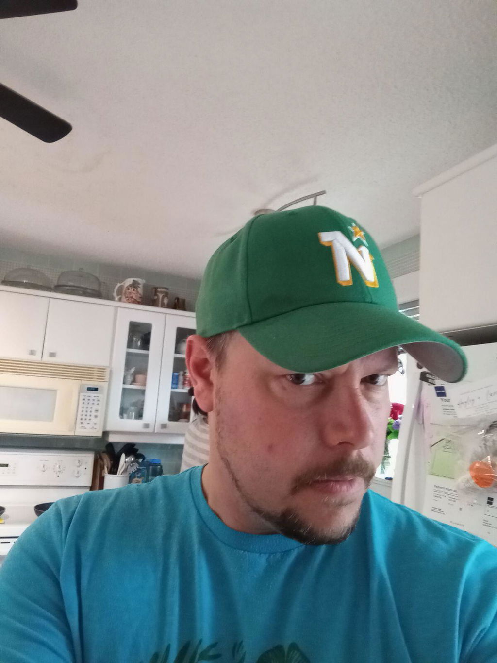
Tendance : '47 x Pond Hockey
ACHETER MAINTENANT
Le '47 MVP a une couronne structurée avec 5 panneaux qui conservent sa forme structurée. Un snapback ajustable vous aidera trouver votre ajustement personnalisé tandis que la visiËre offre juste ce qu'il faut de courbe.
Customers praised this hat for its "stunning" black and gold design and "high quality" construction. The deeper fit is particularly popular with shoppers who have bigger heads, with one noting "the deep fit makes a huge difference." Many called it their new favorite. One customer found the pointy top looks "a bit silly."
What can I say? This one is a perfect 10. The 2 colours compliment each other so well. One of the most underrated colour combos in sports. And the beautiful script on the back saying Millionaires... chef's kiss 😘 👌
My son’s comments:It was awesome and it looks great on me .plus I stuck the Velcro in my hair and it did not stick
As with other products, the colour is amazing. Logo and quality are good. The spot where the dome connects to the beak is a bit bunched up and causes a weird angle.
Quality is pretty good, but the angle and rise of the dome portion over the beak is a little steep. Personal opinion though. It looks great.
Usually have a hard time with ‘47 hats as they look small on my head and the curve doesn’t always sit well with my glasses/sunglasses, but the deeper fit and wider brim curve is perfect for me and my big head.
And I’ve gotten several compliments on it!
Had to Rep The 6IX! ..i have soo many hats,but never bought a raptors one until now. I needed a hat to match with my jordan 1s too🤭 so it was only right.
Hopefully now i can finally go to my first game in style! 🤪🥹
Lovee this hat, its so clean and perfect. Fits great..MVP hats are my favorite, the structure is everything! Great buy.
It's a great hat, well worn, well loved. So good that the old one was replaced with the exact same one for the new school year.
I ordered this hat because the Red Sox’s are my team. But what I really liked was that the 47 emblem was stitched in red also. My first review was mysteriously removed and now the website has changed the picture on the hat. It’s the small things that matter to a costumer. But not even a reply makes for bad reviews. I’m sharing a picture of what I thought I was going to get.
As you can see in the advertisement the 47 logo is in red.. This I thought was cool because it matches the Red Sox logo. Was disappointed to see the 47 logo in plain white. It’s the small things that make a customer happy. But not this time I guess. Think I’ll shop elsewhere now.
Hi Jason,
Our bad, the red logo was last year's model and we missed updating the pic online. We've updated it now to the white.
Did you want to return the cap? If you want to keep it, I can get you 50% off.
Thanks,
Manny
Découvrez ce qui vous échappe
Vous souhaitez être informé des nouveaux produits et des offres spéciales ? Inscrivez-vous à notre newsletter pour découvrir tout ce que vous manquez